Thursday 28 February 2013

Album cover drafts


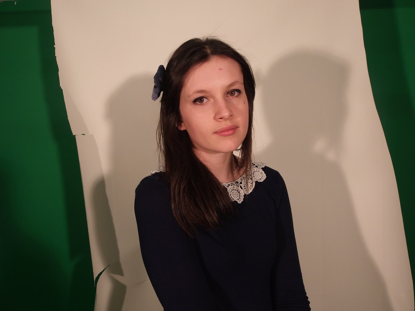
This is my first album cover idea. I arranged for Sadie to meet me in the photography studio to take photographs primarily for the ancillary texts. This is as I initially used screenshots taken from the music video and the quality wasn't very good. I uploaded the photos onto Photoshop and using the "Healing brush tool" created a flawless look as it is a convention that music artists always look there best. Then using 'Curve levels' I made the background very plain so as to make Sadie stand out. Then I duplicated the layer and set the opacity to 60% and using the arrow played around with it to create a double exposure. This links to the music video as there are shots of Kate with double exposure and also the use of different images goes with my kaleidoscope theme throughout the video. I then used a text box to write the artists name over the album cover and made it pink to not only make it stand out but to give the cover a feminine edge which goes with the ideology of Grimes music.


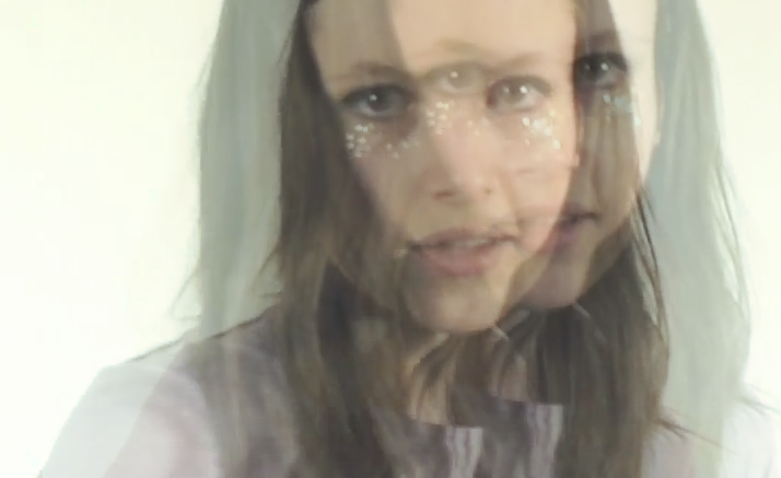
This is my second idea for an album cover, using Photoshop I cropped an image of Sadie to make it square album cover shape and then using the brush tool went over her eyeliner to make her eyes stand out more. I then used the text tool to write 'GRIMES' over in baby pink to add femininity.


Tuesday 26 February 2013

Photos for the ancillary texts

Before:


After:


Today I took some photos of Sadie for the album cover which I'm going to start editing. So far I have done a few edits such as the layers to create a flawless look.

Wednesday 6 February 2013

Ancillary text

My album cover needs to have the same look as the video and therefore I decided upon the idea of a double exposure shot of Sadie as she's the performer. I want to keep the cover simple. I screen shot a clip from the third draft of my music video and using Photoshop used two layers to put one image over the other however slightly to the right. However the quality of the picture due to being a screen shot rather than an original photo makes it look poor. I am going to arrange a time to meet with Sadie and take photos to create the same effect with a better quality and then overlay the artists name.

Friday 1 February 2013

Here is the third draft of my music video


  I have added in some new footage and put more kaleidoscope scenes in.

Repetition of Kaleidoscopes gives the video more of a theme throughout and links each scene to the next therefore it doesn't just look like a montage of abstract scenarios.


I decided to add in some more  close ups of Sadie (the artist) due to there being too many medium long shots making the video predictable.


Errors in the third draft...
I accidentally forgot to line up the bottom mirror image correctly and didn't realise until after I had published it onto YouTube. I have now corrected the error by lining them up correctly.