The first scenes I shot for my music video was the projected images over Sadie lip syncing. . We played around with many different back drops and filmed in the college theatre which I booked especially as I wanted to use the large white backdrop and projector.
1.My first idea was for a kaleidoscope that I found on YouTube as I knew that I wanted to have a lot of mirrored imagery within my music video: http://www.youtube.com/watch?v=q2fIWB8o-bs.
2.I then using Google images got up an album cover for psychedelic band Tame Impala's album "Innerspeaker" which features a trippy mirrored image of a landscape. I filmed Sadie lip syncing in front of it as I thought the flowers added a feminine touch but still had the psychedelic vibe I was hoping to convey in the video.
3. I then went on Tumblr for some inspiration into other backdrops I could use and found some trippy images and GIF's which I then filmed behind Sadie. The first one was of space as I thought it would appeal to my target audience of teenage girls as "space" seems to be fashionable at the moment with shops like Topshop selling space tee's and leggings.
4. I also found a very soft and feminine GIF of pastel coloured flashing lights which fits perfectly into my music video as it has pastel colours which was my main idea from the very beginning with regards to colour themes. Throughout my video Sadie wears light, feminine and pastel coloured clothing to go with the ideology of Grimes.
Wednesday, 3 April 2013


These are the shots of Bryony doing simple hand movements that I have used to create the kaleidoscope at the end of the music video.
1.Using the crop tool I removed the green screen that is visible in the clips.
2. I then placed a black & white effect over the shot
3. Using "brightness and contrast" levels I altered it to have the high contrast effect I desired.
4.Then I copied and pasted the shot so I had two of the same and placed a "vertical flip" on one of those shots so that Bryony would be facing the opposite way.
5. I then dragged this second shot to another layer to create a double exposure.
6. Then I placed a mirror effect on both these shots and using the setting dragged it to create a kaleidoscope image which I am pleased with.
Initially when I shot this scene with Bryony I had intended to have only one double exposure not two.
1.Using the crop tool I removed the green screen that is visible in the clips.
2. I then placed a black & white effect over the shot
3. Using "brightness and contrast" levels I altered it to have the high contrast effect I desired.
4.Then I copied and pasted the shot so I had two of the same and placed a "vertical flip" on one of those shots so that Bryony would be facing the opposite way.
5. I then dragged this second shot to another layer to create a double exposure.
6. Then I placed a mirror effect on both these shots and using the setting dragged it to create a kaleidoscope image which I am pleased with.
Initially when I shot this scene with Bryony I had intended to have only one double exposure not two.
Friday, 15 March 2013
Album drafts


As I have to invent my own name for the artist I came up with two ideas, one is "Vanessa" as it is the name of the song and the second one is "Gothic" as I drew inspiration from "American Gothic" by Grant Wood.

This weekend I am going to print copies of the above album draft and then play around with glitter to create some album covers inspired by "Santogold's" 2008 album cover.


Thursday, 28 February 2013
Album cover drafts

This is my first album cover idea. I arranged for Sadie to meet me in the photography studio to take photographs primarily for the ancillary texts. This is as I initially used screenshots taken from the music video and the quality wasn't very good. I uploaded the photos onto Photoshop and using the "Healing brush tool" created a flawless look as it is a convention that music artists always look there best. Then using 'Curve levels' I made the background very plain so as to make Sadie stand out. Then I duplicated the layer and set the opacity to 60% and using the arrow played around with it to create a double exposure. This links to the music video as there are shots of Kate with double exposure and also the use of different images goes with my kaleidoscope theme throughout the video. I then used a text box to write the artists name over the album cover and made it pink to not only make it stand out but to give the cover a feminine edge which goes with the ideology of Grimes music.

This is my second idea for an album cover, using Photoshop I cropped an image of Sadie to make it square album cover shape and then using the brush tool went over her eyeliner to make her eyes stand out more. I then used the text tool to write 'GRIMES' over in baby pink to add femininity.
Tuesday, 26 February 2013
Photos for the ancillary texts
Before:
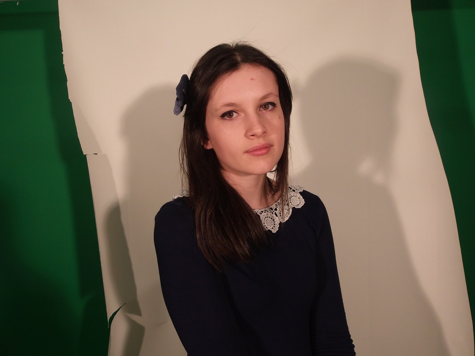
After:

Today I took some photos of Sadie for the album cover which I'm going to start editing. So far I have done a few edits such as the layers to create a flawless look.
Wednesday, 6 February 2013
Ancillary text
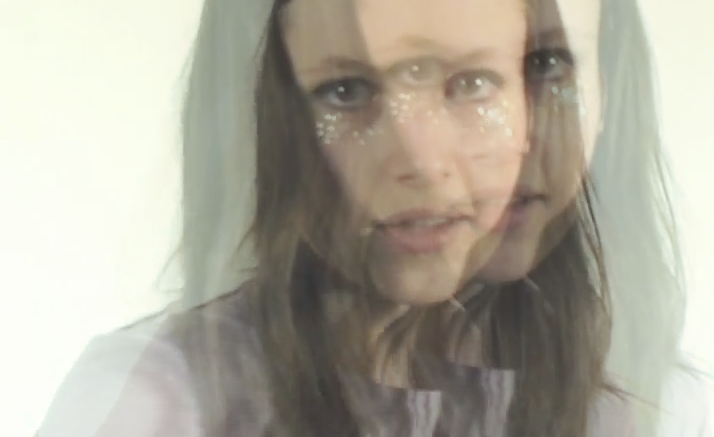
Friday, 1 February 2013
Here is the third draft of my music video
I have added in some new footage and put more kaleidoscope scenes in.
Repetition of Kaleidoscopes gives the video more of a theme throughout and links each scene to the next therefore it doesn't just look like a montage of abstract scenarios.


I decided to add in some more close ups of Sadie (the artist) due to there being too many medium long shots making the video predictable.

Errors in the third draft...
I accidentally forgot to line up the bottom mirror image correctly and didn't realise until after I had published it onto YouTube. I have now corrected the error by lining them up correctly.

Subscribe to:
Posts (Atom)